Print and design professionals react to Pantone Color of the Year
Pantone has chosen a white hue as its Color of the Year for 2026, prompting an array of mixed reactions from across the design and print sectors
Jonathan Pert
December 18, 2025
Cloud Dancer has been described as “a lofty white whose aerated presence acts as a whisper of calm and peace in a noisy world”
The print and design industries have reacted with mixed opinions to Pantone’s decision to make ‘Cloud Dancer’, a shade of white, the Pantone Color of the Year for 2026.
Pantone is the industry-recognised authority and provider of professional colour language standards for the print and design communities.
Pantone’s Color of the Year programme, now in its 27th year, is designed to promote conversations on the impact of colour choice. This year, PANTONE 11-4201 Cloud Dancer was chosen as its Color of the Year, with 2025’s choice having been PANTONE 17-1230 Mocha Mousse.
Pantone describes Cloud Dancer as a “billowy white imbued with a feeling of serenity” which “serves as a symbol of calming influence in a frenetic society rediscovering the value of measured consideration and quiet reflection.”
Mixed Reactions
The choice of Cloud Dancer for 2026 has garnered some controversy since it was announced in early December. The term "Pantonedeaf" has been coined by critics and used in headlines by UK outlets including The Guardian, describing a perceived disconnect between Pantone’s choice and the global mood.
Some critics have argued that choosing a shade of white is ‘bleak’ or ‘dystopian’ in the current social and political climate.
Jose Criales-Unzueta of Vanity Fair even compared the announcement to a "late-night show comedy skit” while referring to potential racist undertones behind the choice. In his opinion, saying "white is the colour of 2026" is out of touch following reported global crackdowns on diversity programs.
Fine art printer, Slay My Art, was instead positive about the choice of colour, saying that Cloud Dancer is “a soft, airy, billowy white that instantly feels calm, clean and effortlessly cool.”
The company continues: “While some people may say ‘But… white isn’t a colour?’, we in the wall-art world know better. White is the ultimate style power move and the perfect backdrop, the quiet luxury statement, the palette cleanser of dreams… for Slay My Print lovers, Cloud Dancer is about to become your new best friend.”
Design agency ADS Oxford, which provides a range of services including custom print, has put forward a more hesitant viewpoint. in a blog post on its website, it described the disappointment of its graphic designer, Ruth Thrower, to the announcement.
Thrower is quoted as saying: “I must admit I am a little disappointed, as some of the predictions suggested teal, which is one of my favourite colours. This will certainly be a controversial choice, not a colour I can get that excited about.” Many graphic designers had reportedly predicted a bolder choice of colour to be chosen such as a vibrant teal or earthy green. Global trend authority, WGSN, had named ‘Transformative Teal’, a fusion of deep blue and aquatic green, as their 2026 Color of the Year. This led many designers to assume Pantone would follow a similar trajectory.
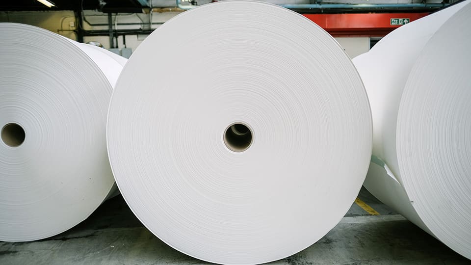
Paper manufacturer, James Cropper, has praised Pantone’s choice of Cloud Dancer for opening up discussions about the impact of different white hues
White Tones and Paper
UK paper manufacturer, James Cropper, has released a detailed and positive response to the choice of Cloud Dancer, saying: “White has always been more than a colour; it is the quiet space between thought and form, the light-filled pause where the eye rests and the mind find clarity.
“Today, in a world buzzing with distraction, white takes on renewed significance. Pantone’s selection of PANTONE 11-4201 Cloud Dancer as the Color of the Year 2026 celebrates this very essence – a lofty, aerated white that whispers calm and serenity into a frenetic society.”
The article goes on to describe how, in the world of print where substrates often start from some base white hue, the choice of white can have a significant impact to the look of the final product. The company therefore welcomes the conversations that the choice of Cloud Dancer is opening up.
In the article, Mark Starrs, principal colour scientist at James Cropper, goes on to describe the complexities of various types of white when choosing printing substrates. He explains: “What is a true white? The answer is layered. A pure, natural white often leans yellow, closer to the inherent hue of the pulp.
“We use Tappi Brightness tests to evaluate the brightness of the pulp that we use. This ensures that we are using the best quality pulp and helps build a strong base product. We can make a variety of whites in between – redder, less blue, more yellow, brighter – and these are controlled by careful control of our papermaking chemistry.”
For those wishing to achieve the soft, tactile feel of Cloud Dancer, printers and designers would need to focus on uncoated, natural-finish papers rather than standard brilliant white stocks.
Substrate options that may roughly match the warmer shade and feel of Cloud Dancer include GF Smith’s Colorplan Natural, Fedrigoni Materica Gesso, or James Cropper’s Rydal Natural White.
James Cropper’s Coloursource lab in Cumbria can also allow for bespoke colour matching, with its "tailor made" service allowing designers to produce a unique paper colour that matches the Cloud Dancer pigment.
Product Integrations
Following the announcement of this year’s Color of the Year, a range of companies have also produced print or packaging products which utilise the Cloud Dancer hue.
UK-based decor company, Art Fever, has released Cloud Dancer canvas prints and roller blinds, marketing the shade as a "visual reset" for interior spaces.
UK luxury packaging specialist, Foldabox, also introduced a range of luxury gift boxes, tissue paper, and ribbons that pair with the Cloud Dancer shade, emphasising its suitability for high-end minimalist branding.
Other product integrations include Post-it, which is featuring the Color of the Year as the centrepiece of a new collection of natural and earth-toned sticky notes.
James Cropper will use London Packaging Week to premiere the official trailer for ‘The Last Mill Standing’, an in-depth documentary exploring the UK’s last remaining specialist coloured paper mill
Nonprofit organisation, Girls Who Print, has released its 2026 report which details what women across the global print industry are saying about careers, technology, and opportunities